A Company Logo - Atlantic Brewers
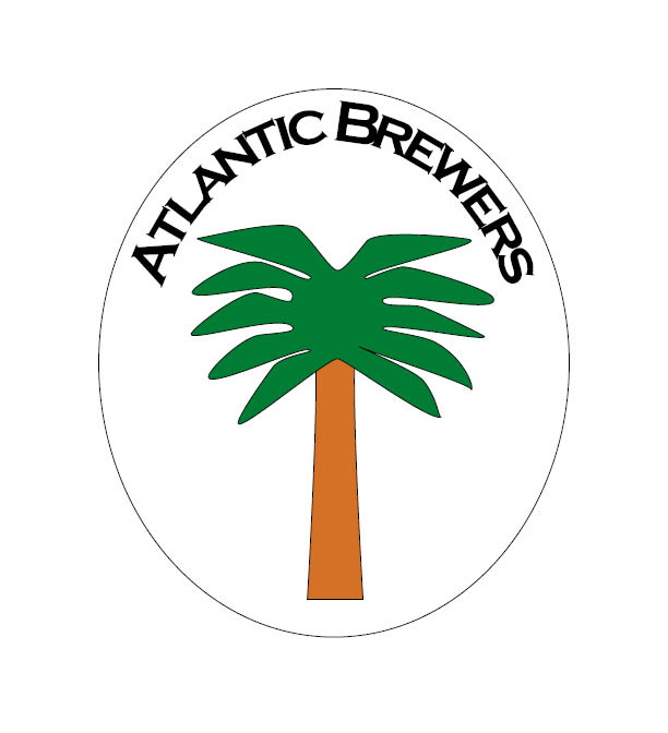
For this assignment, I chose to design a logo for the Atlantic Brewers company. I started this assignment sketching out logo ideas for each company on the list to see which one I felt the most drawn to. The first, Stages of Fame, I knew what I wanted to do - drama masks - but realized quickly that drawing them out would be difficult for me at this point and probably would not be easy to see on the smallest scale. The second company is one that stood out because there is actually a landscaping business based in my hometown by that same name. However, I did not find this would produce a logo that I would be interested in for this assignment. I then went through the rest of the list. I eliminated the law firm because almost every single logo ever created for them looks dull; the restaurant because I love a variety of foods and could not settle on one for my own fictional restaurant; and the power company since it would have been too easy to do (I drew a sun for that one). I felt that out of the six companies, this logo would be the cleanest visually to create while giving me the opportunity to test my skills in designing a unique logo.
The first step was to decide on the symbol to use in the design. Since Atlantic Brewers is supposed to be a local business as well as a worldwide distributor, I chose to reflect an homage to local roots using a palmetto tree. If you look at images of local breweries online, they usually feature something that ties them to the area where the business is located (a pelican, a tree, ocean waves, etc.). A palmetto tree is one of the symbols on the state flag and is something that is found everywhere in the Charleston area, which is why I chose it. I drew out the trunk first, using the tools to give the trunk a slightly convex look. I drew the branches out by creating a polygon and tweaking it to look like fronds. I wanted each frond to look a little different from its neighbor because no fronds on a real palmetto tree fall the same on every side. I added anchor points and used the direct selection tool to place the fronds where I wanted them and how I wanted them to look.
As discussed in the logo guidelines, I decided on a simple color scheme that would translate well to black-and-white printing and color. I wanted to limit the pallet to 3 colors at the most so that the logo would be more pleasing visually. I originally wanted to color the tree in the same shade as beer and use a gradient to color the top of the tree to look like the foam in the top of the glass, but I could not adjust the gradient to my satisfaction. I then switched to coloring the palmetto tree trunk light brown and the branches green. Now with this color scheme, the logo will not blend in to its surroundings, like a glass or bottle. I added the stroke path to give it the appearance of a label like the ones seen on other brewery logos.
I placed the company name at the top by typing the text on a path. I wanted the name to sit at the top where it would easily be seen first on the logo. I used a Gothic font and made the name in all bold capital letters to help catch the eye of a client or customer. I thought about added a "Since (year)" on the bottom of the logo, but decided against it since that was not provided in the company description. The font is easy to read in all three sizes specified for the assignment, and did not become distorted and need adjustment when the image was scaled down.
A Magazine Advertisement - Sawdust Festival
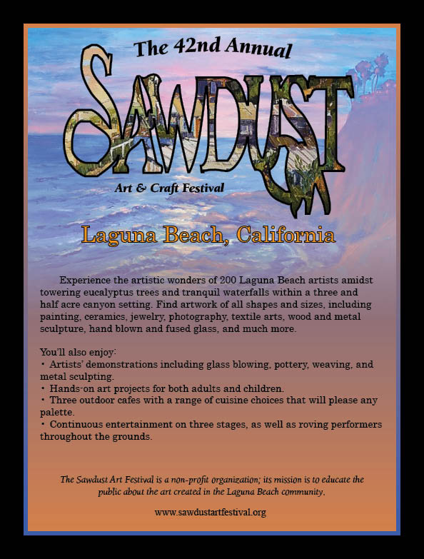
This assignment was a bit tricky for me, mainly because I had to do three versions before I was satisfied with how the advertisement turned out. As the directions stated, I used Project 2 from the book as a guide for the assignment. I wanted to create an advertisement using the same techniques from that project and decided to use the actual Sawdust Festival logo as the centerpiece of the ad. I had originally planned to use the colors from the logo in the ad, but decided against it. I know that local festivals will have a unique logo for each year, and I wanted to make something that stood out. I wanted to create an advertisement that had a sort of local flavor to it; something that showcased the artwork one might see at the festival.
I wanted to accomplish this by using images of paintings by Laguna Beach artists. The aim here was local festival, local artists. I found two images online - Hovik Koda's "Laguna Beach Sunset" that I used for the background image, and Liliana Simanton's "Crystal Cove, Laguna Beach". I then took the festival logo and created a clipping path around it. I placed the image of Simanton's painting inside the logo's frame. I realized that the text underneath the logo was messed up in the process, so I had to remove it and create a text box to place underneath the logo in its place. I also had to adjust some of the anchor points of the letters in the logo to keep it from looking distorted. I only used these two images to keep it from looking busy. I did not want to add anything to it that could possibly take away from the festival logo, which is the centerpiece of the advertisement.
Entering the text was quite simple. I chose to place "42nd Annual" above the logo with the festival location underneath it. I made the text for the location an orange color with a stroke around it to make it stand out. I then created a text box and pasted the information from the text file into it, using left align instead of center. I changed the spacing of the text so it was not right up against the edges of the text box and used a bulleted list for the features of the festival. I placed the website at the bottom of the ad with the mission statement right above it. I used two different fonts, but kept it to just those two because I did not want to make the ad look "busy".
The Hollywood Sandwich Shoppe Menu
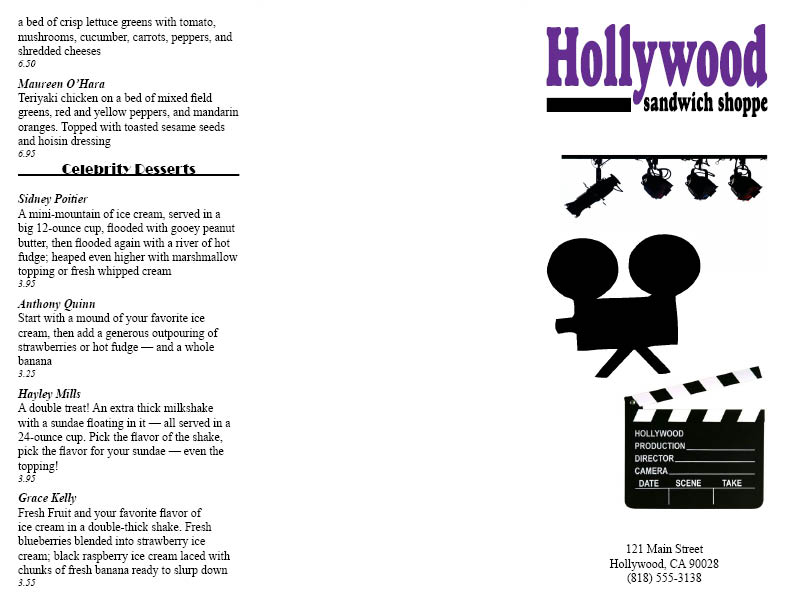
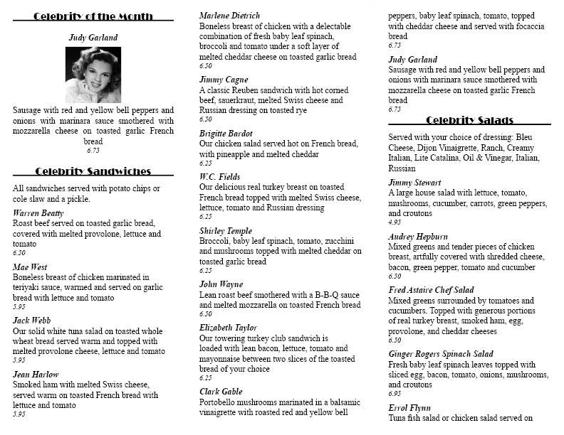
This assignment deals with creating a menu for a restaurant, using Project 4 in the textbook as a guide. I think out of all the assignments we have had for this class so far, this one was my favorite for no other reason than the fact that I love old movies. I have seen movies that featured actors mentioned on this menu as members of the cast. Because many of those movies are classic, iconic films, I decided to use that as the basis of my design for the menu. I started with the template for the menu itself. I originally wanted to have four pages - a front page for the logo, a blank back page, and two inside pages with two columns per page for the menu. I found out quickly, however, that this would not work as the menu was too long. I then decided to switch to a letterfold template, which worked out much better for the layout of the menu. The menu is on the inside panels, with the desserts on the inside flap. The front logo is on the front right panel.
After creating the template, I placed the menu list into it and began formatting. I changed the "Category" font to Broadway and centered it. This style font was used a great deal back in the 1940s for marquees and movie posters, and because a good deal of the celebrities used on the menu are from that era I thought it would be a good choice. I then changed the spacing a bit and added a line underneath the category names. I did not change the layout of the item names or prices since I liked the way they had already been done. I added the restaurant's logo to the front panel and decided to add in some extra artwork to the front underneath it. Since it is an old Hollywood theme, I wanted to do a "lights, camera, action" set of pictures on the front. I found images through Google of movie lights, and old camera and a scene slate. I arranged them so they fall in the same order as they do in the phrase "lights, camera, action". Except for the restaurant logo, all of the images that I found online and used for this assignment are black and white. I did this in compliance with the art director and client comments in the assignment outline. For the final part of this assignment, the monthly special, I was a little confused as to whether we were supposed to make up a new dish for the menu and add it as a special or use one of the specials already on the menu. I decided to use an already listed menu item for the monthly special. The layout for this part of the menu I made a bit different, just to make it stand out a little more. I centered the name, description and price of the item underneath a picture of the celebrity it is named after. I used Judy Garland for this assignment, mainly because I love her work and found a picture of her that I immediately wanted to use. I chose a black and white image, and resized it to fit in the space designated in the menu.